
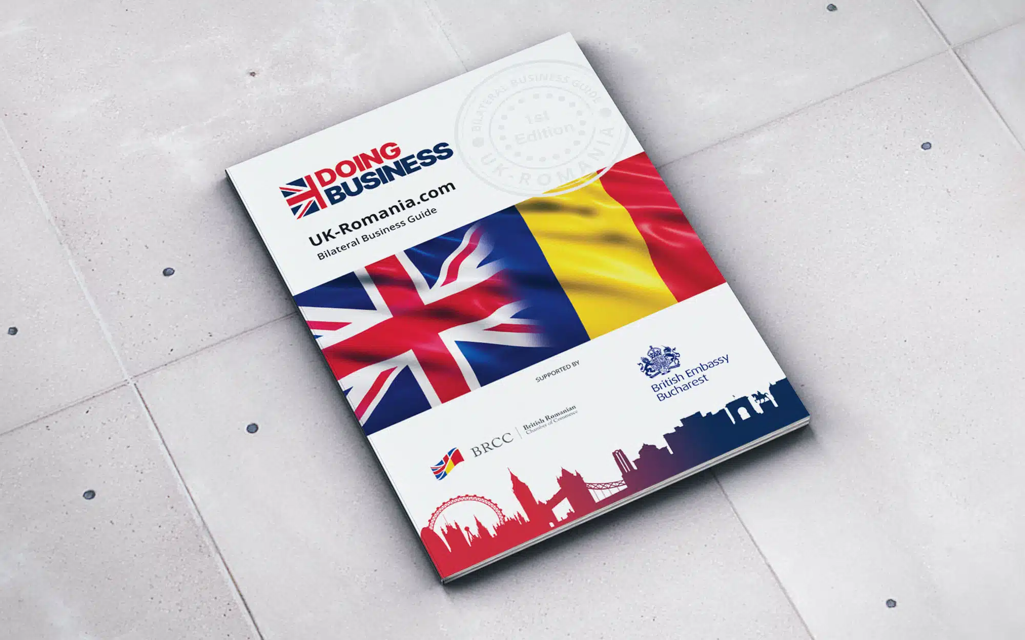
In today’s fast-moving digital publishing world, visuals are no longer just decorative extras—they’re the first impression, the emotional hook, and often the deciding factor in whether a reader stays or scrolls away. For modern magazines, especially digital-first platforms, design has become just as important as editorial quality. Among all visual elements, banners stand out as one of the most powerful tools for communication, branding, and engagement. Whether it’s a feature highlight, a promotional campaign, or a section divider, well-crafted visuals can completely change how content is experienced.
What’s interesting is how accessible design has become. Not long ago, creating professional-looking visuals required advanced software skills or a dedicated design team. Now, even independent publishers and small editorial teams can produce polished, high-impact graphics in minutes using intuitive online tools like a banner maker. This shift has completely reshaped how magazines plan their content strategy, allowing creativity and speed to work hand in hand. Instead of waiting days for design revisions, editors can now test ideas instantly, refine visuals on the go, and publish content that feels fresh and relevant.
The Rise of Visual Storytelling in Magazine Culture
Modern readers don’t just consume content—they experience it. This is especially true in digital magazines where attention spans are short and competition is intense. A strong visual identity helps publications stand out in crowded feeds and social platforms. Banners, in particular, act as visual signposts. They guide readers through stories, highlight key sections, and establish tone before a single word is read.
Think about a lifestyle magazine covering topics like travel, fashion, or wellness. A bold, well-designed banner at the top of an article immediately sets the mood. A travel feature might use sweeping landscape imagery, while a tech article might lean into sleek, minimalistic visuals. These choices aren’t random—they’re strategic. They help shape perception and influence how readers emotionally connect with the content.
Even beyond aesthetics, banners play a functional role. They improve navigation, break up long-form articles, and help structure content in a way that feels intuitive. In an era where readers skim more than they read, this kind of visual hierarchy is essential.
Why Design Accessibility Has Changed the Publishing Game
One of the biggest transformations in the publishing industry is the democratization of design. Editors and writers are no longer dependent on specialized designers for every visual update. Instead, user-friendly tools allow teams to experiment freely with layouts, typography, and imagery without needing deep technical skills.
This has had a direct impact on productivity. Editorial teams can now respond to trends in real time. For example, if a particular topic suddenly gains traction—say sustainable fashion or AI tools in media—publishers can quickly create matching visuals and update their articles to reflect the trend. This flexibility is crucial for staying relevant in a fast-moving digital environment.
It also encourages experimentation. Smaller publications, which may not have large design budgets, can now compete visually with major media outlets. With ready-made templates, customizable layouts, and intuitive editing features, even a single editor can produce content that looks professionally designed. The result is a more level playing field in the world of digital publishing.
Real-World Applications in Magazine Publishing
To understand the value of strong visual design, consider how different types of magazines use banners strategically:
A fashion magazine might use them to showcase seasonal collections or highlight editorial themes like “Spring Elegance” or “Winter Minimalism.” These visuals don’t just decorate the page—they define the entire narrative of the issue.
A business or finance publication may use more structured, data-driven banners. Clean lines, bold typography, and subtle color palettes help communicate trust and authority while reinforcing key insights.
Lifestyle and entertainment magazines often take a more creative approach. Here, banners are used to capture emotion—whether it’s excitement, curiosity, or inspiration. Eye-catching visuals help drive clicks and encourage social sharing, which is essential for audience growth.
Even niche publications benefit. Educational magazines, for instance, use banners to simplify complex topics. A well-designed visual can make an abstract concept feel approachable, helping readers engage more deeply with the material.
Practical Tips for Creating Effective Magazine Banners
While tools have made design more accessible, good visual communication still requires thoughtful execution. Here are some practical principles that editors and content creators should keep in mind:
First, clarity always comes before complexity. A banner should communicate a single idea at a glance. Overloading it with too many elements can dilute its impact and confuse the reader.
Second, consistency matters. A magazine’s visual identity should feel cohesive across all sections. This doesn’t mean every banner should look identical, but there should be a clear design language—consistent typography, color schemes, and spacing.
Third, hierarchy is key. The most important message should always stand out first. Whether it’s a headline, a call-to-action, or a featured image, readers should immediately know where to focus.
Finally, adaptability is essential. With audiences accessing content across multiple devices—from smartphones to desktops—banners must be designed to look good at every scale. Responsive design thinking is no longer optional; it’s a necessity.
The Future of Magazine Design and Visual Identity
As digital publishing continues to evolve, the role of visuals will only become more significant. We’re moving toward a landscape where design and content are fully integrated, not separate processes. Artificial intelligence, automation, and smart templates are already influencing how layouts are created, but the human touch remains irreplaceable.
Magazines that succeed in the long term will be those that understand how to balance efficiency with creativity. Visuals will continue to shape reader perception, but authenticity and storytelling will remain at the heart of great publishing.
In the end, design is not just about looking good—it’s about communicating better. And in a world where attention is the most valuable currency, the ability to tell a story visually is no longer optional. It’s essential.
